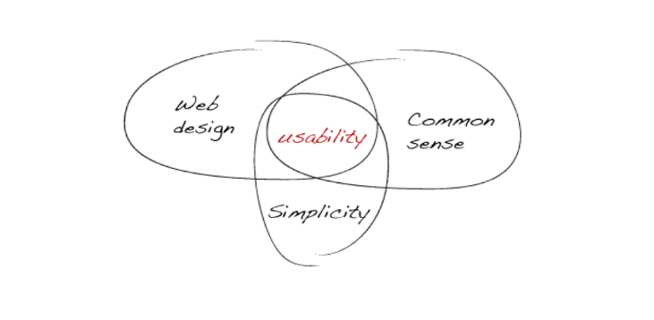
‘Usability’ and ‘Accessibility’ are terms often misused and confused. This article aims to explain the differences between the two terms, their meanings and where they overlap.
The Short Answer
Usability is a measure of how easy a system is to use.
Accessibility means access to all, regardless of technological and physical means. This ranges from people with screen readers to those with mobile phones, PDAs or slow modems.
The Long Answer
Usability
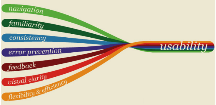
Usability is the quality that determines how user interfaces are clear and easy to use. This could be expounded in more detail as follows:
“Usability is the extent to which a product, designed for a particular use scenario by a particular user, contributes to their bottom line in the most efficient and comfortable way possible.”
Or in short:
“Usability is design from the user’s point of view.”
The term itself also refers to various methods of improving and easing interfaces. This concept focuses more on functionality and ergonomics than on visual and aesthetic aspects. Usability is interested in the result of the client’s interaction with the system and the construction of the path to it.
What is usability consist of

One of the founders of this direction, interface specialist Jakob Nielsen, defined the following usability components from a user’s point of view:
- Usability – how easy it is for users to perform basic tasks, usage scenarios, when they encounter an interface for the first time;
- Efficiency – how quickly users can perform tasks when they are already familiar with the design;
- Memorability – how easy it is for users to regain proficiency with the interface when they return to it after a long period;
- Errors – the frequency of usage errors, how serious they are, and how easy it is for the user to recover from them;
- Satisfaction – how pleasant the design is to use.
Nielsen also suggests evaluating the Usability of interfaces and defining Usability using the formula:
Usability = Usability + Functionality, where
Functionality – whether the interface gives you what you need;
Usability – how easy and pleasant it is to work with.
Nielsen also described 10 principles of good usability:
- Visibility of system status;
- Consistency between the system and the real world;
- Control and freedom of choice in the user;
- Consistency and standardization;
- Error prevention;
- Recognition is better than recall;
- Flexibility and efficiency of use;
- Aesthetics and minimalist design;
- Helps users recognize, diagnose and recover from errors;
- Help and documentation.

Why usability is important
Advances in technology have made the principles of building and using systems more and more complex. Nowadays many things can seem trivial, but historically simple and familiar to us tasks were not so easy to perform in the past.
For example, working with a word processor or interacting with web pages. The ease and accessibility of working with these things is in no small part the merit not only of technical progress, but also of interface optimization. Specialists adapt the interfaces to the end user, including and above all the one who has no special knowledge.
As a consequence, this facilitates and accelerates training, expands the list of available skills, simplifies a number of tasks, or allows you to solve completely new ones, and increases labor productivity.
In terms of perception, the importance of usability is as follows:
- Users can concentrate on completing their tasks in a normal workflow. They do not need to understand the menus of the interface or understand the internal architecture of the software, the structure of controls, the meaning of icons and buttons. In other words, they don’t have to think about how to convert a task into an “input” command for the computer and how to complete a full cycle of operations.
- Users do not need to thoroughly understand the functioning of computer hardware and software.
- Users can’t be distracted or confused by the interface as they interact with it. All work steps and specific operations are simple, straightforward, and reproducible with expected results.
- Users can work normally with the interface in most conditions and scenarios.
From the user’s point of view, he can calmly and productively work with the program and not feel incompetent.
From the developer’s point of view, usability is an important aspect of the demand and popularity of the system as a whole, because it is created for someone.
From a manager’s point of view, products with poor usability will take more time and energy to learn from the user, and this is a very bad competitive “advantage.
Apple, for example, has built its strategy almost entirely on the following grounds since its founding by Steve Jobs and Steve Wozniak. Products, both software and devices, had to be more user-friendly. As a result, users became willing to pay more for everything to be simple, understandable and work “out of the box” – out of the box.
Finally, in terms of interfaces participating in sales – online stores, cash registers and self-service terminals – a person can’t buy what they can’t find.
This is the first rule of e-commerce.
On the Internet, if a user can’t find something, he goes away. Even if a page doesn’t load for more than 2 seconds a huge percentage of users refuse to view it.
- If the user doesn’t understand what exactly the company offers, what it does and what can be useful for him, if its site is inconvenient to use, he leaves.
- If the information is not presented clearly, it is difficult to read, and its content does not answer his key questions – he leaves.
What is web accessibility?
In fact, the term accessibility is a subset of the more general and well-known term usability.

Usability is the efficiency and satisfaction with which a user achieves their goals.
Accessibility – equal access to content for all users, including those with any impairments.
Thus, increasing the accessibility of the product, we also increase its usability. Achieving 100% accessibility means the ability to use the full functionality of the product by absolutely any user (including those with disabilities). It is important to understand that “limited capabilities” when using applications can occur both in chronic health conditions (according to the UN statistics, ~15% of the world’s population has some form of disability) and in temporary life circumstances.
Let’s talk about limitations in more detail.
About “disabilities”
The main types of chronic disabilities:
- Vision.
Total/partial blindness/daltonism.
- Hearing.
Total/partial deafness.
- Musculoskeletal system.
Various types of paralysis/tremor/absence of limbs.
- Mental development.
Impairments related to information perception/remembering.
In addition to permanent impairments, impediments to using apps can be temporary and situational. Let’s look at examples of impediments when a person can only use a product with one arm:

Even factors such as bad Internet connection, screen sharing on a projector with low contrast or a lost mouse (and thus interaction with the interface using the keyboard) are situational barriers for using applications, and one of the important tasks of IT professionals is to mitigate their impact on user experience.
And of course, over time, each of us will face some limitations – as we get older our motor reactions, eyesight and hearing become weaker, and the level of automation and functionality of applications increases. So by making interfaces accessible now, we are also taking care of ourselves in the future.
Who and why should implement accessibility?
There is no special person who will implement accessibility in your product. It requires the involvement of the entire team:
- UX/UI designers – designing interfaces, following accessibility guidelines
- Programmers write proper page layout, make sure that all elements have the required tags and attributes
- Testers – do accessibility testing.
The main motivation for implementing accessibility:
- Empathy: we can minimize barriers between users and content, thereby making their lives better. But if you’re not as sensitive and receptive, there are other pretty compelling motivations.
- Competitive advantage: increasing the percentage of satisfied users.
As I mentioned earlier, up to 15% of users have permanent, temporary or situational barriers to interacting with the Internet. No matter what your company focuses on – websites, mobile or desktop apps and services – when you implement accessibility, you achieve an increase in the percentage of users who can successfully interact with your resource.
Among other things, accessibility is one of the modern trends in the IT world, the use of which improves the image of your company. - Law: a prerequisite for product development for large international projects. In most EU countries, as well as in the UK, USA, Canada, Australia, Brazil, and India, accessibility standards are set by law.
How to implement it?
Spoiler alert: it’s enough to follow existing standards!
Most of the work has already been done for us. There are standards with guidelines that can be followed to make any content accessible:
- WCAG (Web Content accessibility guidelines) by the W3C
https://www.w3.org/WAI/standards-guidelines/wcag/ - Section 508 (applies to territories in the US)
https://www.access-board.gov/guidelines-and-standards/communications-and-it/about-the-ict-refresh


