by Megan McDermott, 8 September 2008 - 1:52am
One of the most important parts of the initial design process is the choice of colour scheme. If your client or topic of interest already has a set of preferred colours, your choice is easy. However, there are many occasions where the choice is entirely up to you. For many people, deciding on the colours can be a difficult task. Armed with a little colour theory, some great online tools, and your own design sense, you can create attractive and unique colour schemes for your website designs. This article will show you how.
First, some colour theory
Before we go too far it's important to have an understanding of how colour works. There are three basic properties of colour:
-
Hue (the colour)
-
Saturation (or intensity)
-
Brightness (or value)
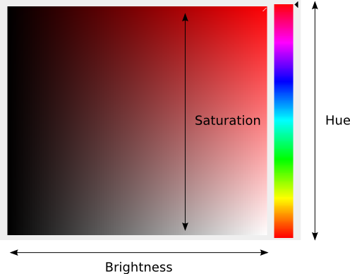
In colour tools in your favourite graphics program you may see something like this:

The horizontal axis shows the brightness while the vertical axis shows saturation. The slider on the right side adjusts the hue.
Colours are also often depicted using the colour wheel:

This wheel shows the relationship between hues. We'll come back to this later.
What about web safe colours?
In the old days, video cards were restricted to 256 colours or less. A palette was devised that was common to the displays available at the time. Now, monitors can display millions of colours, making this palette obsolete. There is an exception if you are designing for mobile or other alternative displays that have restricted colour palettes.
However, monitors are still often adjusted differently, meaning that colours may not look exactly the same on different displays. It's a good idea to check your design on different monitors to make sure it always look good. Laptop computers usually tend to be less saturated than desktop displays.
Choosing a colour scheme
There are many things to keep in mind when choosing an attractive and appropriate colour scheme:
Have a Defined Colour Scheme
Your design will have a much more unified and attractive look if you a defined set of colours. A set group of colours helps to give the site consistency and a character that people will remember.
Limit the number of colours
It's usually best to restrict your scheme to two or three colours, plus white. This makes your job easier as a designer and helps to create a coherent look. Once you gain experience you can start to expand your schemes with more colours. Of course, you can always use variations of the colours you've chosen by varying the brightness.
In addition, it's best to use one colour as the dominant colour while using the other colours as accents. The colour scheme for A Padded Cell looks like this:

Choose colours that are appropriate for your topic
You may notice that certain colours have an effect on the way you feel. As a designer, you should take advantage of this to set a certain mood for your site. It might help to write down some words that describe the type of atmosphere you're trying to create. It could be something like:
-
vibrant, exciting, passionate
-
responsible, traditional, organized
-
calm, serene, spiritual
Now match the words you wrote down to the colours listed below.
What colours mean:
-
Red: energy, strength, power, passion (also fire, blood, love and romance; often used to highlight or emphasize key information)
-
Orange: enthusiasm, fascination, happiness, creativity, determination, attraction, success, encouragement, stimulation
-
Yellow: hope, joy, happiness, intellect, energy
-
Green: growth, harmony, freshness, stability, renewal, health, endurance; also associated with nature and money
-
Blue: trust, loyalty, wisdom, confidence, intelligence, faith, truth (blue is the most popular colour in web design - use it with a contrasting accent colour to make your scheme stand out)
-
Purple: wisdom, dignity, independence, creativity, mystery, ambition, luxury
-
Brown: credibility, stability, reliability, earth
-
Grey: security, maturity and reliability (also gloominess and sadness; useful for unifying a contrasting colour scheme)
-
White: spirituality, peace, purity, simplicity, cleanliness, clarity, perfection, goodness, fairness
-
Black: power, strength, sophistication, formality, elegance, wealth, mystery, sexuality, secretiveness, drama
If you're feeling particularly creative you can choose a contrasting scheme to show several meanings. Such as:
-
strength, power, passion (red) + loyalty, wisdom, intelligence (blue – see why so many countries choose this combination for their flags?)
-
trust, loyalty (blue) + creativity (orange)
-
yellow (intellect, energy) + red (energy, power, strength) + black (power, strength). See how the meanings overlap here?
Variations of colours can also have different meanings. For example, light red (pink – feminine, delicate) has a very different meaning from dark red (strong, powerful, traditional). Lighter variations generally move towards white meaning (spirituality, simplicity, goodness) while darker variations move towards black (power, sophistication, drama). Check the references below for more on the meaning of colour.
Using the colour wheel
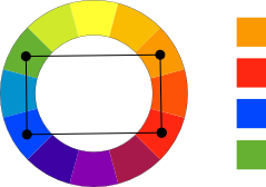
The colour wheel can help to choose effective colour schemes:
-
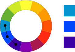
Analogous schemes use adjacent colours

-
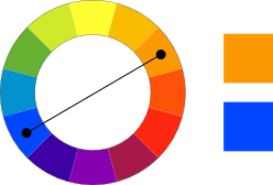
Complementary schemes use opposite colours

-
Split complementary schemes use one colour and two that are adjacent to its opposite

-
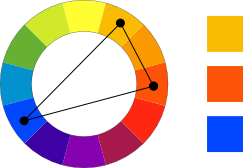
Triadic colour schemes use colours connected in a triangle

-
Rectangular (or tetradic) colour schemes use colours connected in a square or rectangle

These are quite abstract colour schemes and you probably wouldn't use them in a real design. However, they can be useful for brainstorming about colours that work well. Wellstyled's colour scheme generator can help you choose colour schemes based on one of these four methods. Try using the "pastel" variations.
Use neutrals effectively

The A Padded Cell scheme also balances very bright colours with neutrals. The dark grey balances the bright green while the beige balances the hot pink. It's usually good to have one neutral colour in your design (such as grey or beige), especially if you're using some very bright colours.
If you are using very bright colours you should limit the number of colours, use them in small chunks (no large blocks of neon green, please!), and use desaturated colours to neutralize them. Notice how the green and pink are mainly used for text on this site.
Try something different
Once you've mastered all of the above, it's time to try something new. Sure, blue always looks good and everyone likes it, but it has become very overused. Your site is less likely to stand out if you use the same colour scheme as everyone else.
Consider the following colour schemes, all using blue:


They all use blue but they're certainly not boring!
These colour schemes are borrowed from the Colour Schemer Gallery.
Using monochromatic colour schemes
Monochromatic schemes use several variations of the same colour. This can be an appropriate choice but you have to make sure you choose your variations correctly. Consider the following examples:

Notice how this scheme seems a little bit off? That's because the hues are slightly different - the second colour is a little bit more yellow while the third is more blue.

This example shows three shades of green with the same hue. Much better!
When using monochromatic colour schemes, always start with the same hue. You can then play with the brightness and saturation to get different variations of the same colour.
Using colour scheme generators
There are many tools that can be useful in generating colour schemes. These generators can be particularly helpful when choosing accent colours.
Here are a few of my favourites:
Remember that these tools are based on mathematical calculations and may not always come up the best combinations! You still need to use your design sense to make sure your colours work well together (or ask for a second opinion).
What to do when you're really stuck
If you still aren't sure what colours go together you could:
-
Choose one colour and use it with black or grey and white.
-
Borrow a colour scheme from another design. This could be a favourite shirt, a sports uniform, or a website design.
-
Use a colour scheme generator to pull a colour scheme from a photo. Landscape photos tend to have particularly harmonious colour schemes. Try:
-
Many sites have pages and pages of suggestions:
A note on colour blindness
Approximately 2% females and 8% of males have some form of colour blindness. It's a good idea to check your site using a colour blindness tool to make sure that these users will be able to use your site. The Wellstyled.com colour generator includes a filter for common forms of colour blindness.
There are many forms of colour blindness and you don't need to test for all of them. Red/green colour blindness is the most common. In this case it's not vitally important that the site looks great, just as long as everyone can read your content. This color blind web page filter will show you how your site will look to a person with colour blindness.
Summary
Colour schemes can be tricky but with the right tools you can find an attractive and appropriate scheme for any site.
References
Discussion
Discuss this article in the forums.
