by Megan McDermott, 5 October 2010 - 3:52pm
All CSS properties have a specified type of value they can accept. Values may be keywords, lengths, colours, numbers, or url's. This article will explain some of the specifics of CSS values, including how colours are specified, what units of measurement are allowed, and how URL are specified.
Contents of this article
-
Keywords
-
Colours
-
Units of measurement
-
URL's
Keywords
One of the most common types of values in CSS is a simple keyword. These values are fairly self-explainitory, telling the browser to make a font bold, or a border thin, or to set the list bullets to 'disc'. Consider the following examples:
font-size: smaller;
font-weight: bold;
border: thin;
background: none;
list-style-type: disc;
Colours
Many CSS properties describe the colour of objects, including boxes, fonts, borders, and backgrounds. Colours can be entered using three different notations: keywords, hexadecimal values (or "hex" values), and RGB.
Keywords are simple, standardized, words to represent common colours. They include red, blue, green, black, white etc. Keywords aren't commonly used in CSS, mainly because the colours available are limited and probably not the most attractive choices. CSS Specifies only 17 official keyword colours, but most browsers support many more (although these are not standard CSS and may not validate).
Hexadecimal (or 'hex') values are representations of RGB colours in a 6-digit format.

The first two digits represent red, the middle two are green, and the last two are blue. These numbers are in hexidecimal format, meaning that instead of the usual 10 digits (0-9), there are 16 (0-9, followed by A-F). Each digit represents the intensity of the colour, with 0 being an absence of colour, and F being full intensity.
The example above has a lot of red, no green, and maximum blue, resulting in a lighter purple colour.
In CSS, a hexidecmal value must be preceded by a hash mark (#). For example:
background-color: #333333;
Shortened, 3-digit hex values are also acceptable. In that case, instead of using two digits to represnt red, green, and blue, only one is used. For example, the previous example could be shortened to the following:
background-color: #333;
An RGB colour code uses three numeric values to represent red, green, and blue values. The numeric values represent the intensity of the colour on a scale between 0 (no colour) and 255 (maximum intensity).

In CSS, a RGB value is specified like this:
color: rgb(153,0,255);
This example shows the same colour as illustrated in the hexadecimal illustration above (9900ff). There is a lot of red, no green, and blue is at full intensity.
Additional examples:
|
Colour |
Keyword |
Hex value |
RGB value |
Result |
|
|
black |
#000000 |
rgb(0,0,0) |
the absence of any colour results in black |
|
|
gray |
#808080 |
rgb(128,128,128) |
equal amounts of all colours results in grey |
|
|
white |
#ffffff |
rgb(255,255,255) |
full intensity of all colours results in white |
|
|
red |
#ff0000 |
rgb(255,0,0) |
full intensity red, no green or blue results in a very bright red |
|
|
blue |
#0000ff |
rgb(0,0,255) |
no red or green, full intesity blue results in a bright blue |
|
|
N/A |
#9900ff |
rgb(153,0,255) |
lots of red, no green, and full intensity blue results in purple |
|
|
N/A |
#ffcc00 |
rgb(153,255,0) |
lots of red, full intensity green, and no blue results in yellow |
CSS 3 provides several additional methods for specifying colour including RGBa (RGB with alpha transparency) and HSL (hue-saturation-lightness). The latest versions of most major browsers do support these values so you can start experimenting with them now.
What are 'web safe' colours?
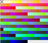 You may find some references in books or online articles to "web safe colours". The web safe colour palette was a set of 64 colours that displayed reliably across different types of monitors. This was needed in the 1990's when monitors had limited numbers of colours available. Now monitors all display millions of colours, so it's not necessary to conform to the web safe palette.
It is important to keep in mind that monitors will display colours slightly differently depending on the type of monitor, operating system, and the user's colour settings. Some colours, such as yellow, are more affected by these variations than others. It is always a good idea to check your design on different computers.
Units of Measurement
In CSS you will need to specify sizes of elements. The two most common units of measurement are pixels (px) and em's. Pixels are relatively straightforward, but you may not have encountered em's before.
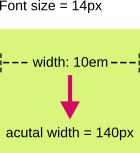
Em is a relative measurement based on the font size. If the font size is 12 pixels, 1em would be equal to 12px. If the width of a box is 10em, and the font size is 14 pixels, the width would be calculated to 140 pixels.

A percentage value is also valid for most elements. According to the CSS2 specification:
Percentage values are always relative to another value, for example a length. Each property that allows percentages also defines the value to which the percentage refers. The value may be that of another property for the same element, a property for an ancestor element, or a value of the formatting context (e.g., the width of a containing block).
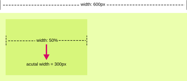
For example, when defining line-height (or line spacing), a percentage size is relative to the font size. If the font-size was 10px, and the line-height was 120%, the line-height would be calculated to 12px (10 x 120% or 10 x 1.2). When defining a width for a box, a percentage width is relative to the size of the containing box. If the containing box was 600 pixels wide, and the width of the inner element was 50%, the width would be calculated to 300 pixels.

Relative values (ems and percentages) are useful when you want your design, or parts of it, to scale depending on the browser size and font settings. One thing to keep in mind is that browsers have different methods of rounding when calculating percentages. If your percentage width resulted in a fractional pixel value (e.g. if the above width was 601px, 50% would be calculated to 300.5px), you may find some rendering differences between browsers that could break your design.
If the length of an element is 0 (e.g. a margin or padding), it is not necessary to include a unit. Instead of:
margin-left: 0px;
you could simply use:
margin-left: 0;
With any other length the units must be included.
Other units of measurement available in CSS are points (pt), centimetres (cm), millimetres (mm), and inches (in). These are absolute units of measurement that have no meaning on a screen display made up of pixels. They may be useful when designing stylesheets for print.
URLs
Some CSS properties accept a URL reference. For example, when defining a background-image, you must tell the browser where to find that image. The URL value begins with 'url', followed by an opening bracket, an optional opening quote, then the URL, then an optional closing quote, and the closing bracket:
background-image: url('../images/background.gif');
The quotes may be single (') or double (") and are optional.
The URL may be an absolute or relative path. An absolute path includes the full http reference to the file (e.g. http://example.com/images/background.gif). A relative path is specified relative to the CSS file not to the HTML document. In the previous example, the stylesheet is located in a folder on the server. The browser would go up one level in the file hierarchy and look in the images folder to find background.gif.
Discussion
To discuss this article or ask questions, please visit The Webmaster Forums discussion on CSS fundamentals: Data types.
Resources


 You may find some references in books or online articles to "web safe colours". The web safe colour palette was a set of 64 colours that displayed reliably across different types of monitors. This was needed in the 1990's when monitors had limited numbers of colours available. Now monitors all display millions of colours, so it's not necessary to conform to the web safe palette.